
Colour in interiors affects mood by changing how the brain responds to light wavelengths, which then influence emotions, energy levels, and even how spacious a room feels. Using colour psychology strategically lets interiors feel calmer, cozier, or more energetic depending on the palette and contrast chosen.
How Colour Affects the Brain and Mood
Colour is the result of light at different wavelengths hitting the eye and being processed by the brain, and these wavelengths are linked with different psychological responses. Warm colours like reds and oranges tend to stimulate and energise, while cool colours like blues and greens tend to calm and relax, which is why they are often used differently across rooms. Bright, saturated hues feel lively and attention-grabbing, whereas muted or pastel tones create softer, more soothing environments.
Emotional Profiles of Key Colours
Red and orange are associated with passion, energy, excitement, and sometimes tension, so they work best in accents or social areas rather than large bedroom walls.
Blue and green promote calmness, focus, and tranquillity, making them popular in bedrooms, bathrooms, and workspaces where relaxation or concentration matters.
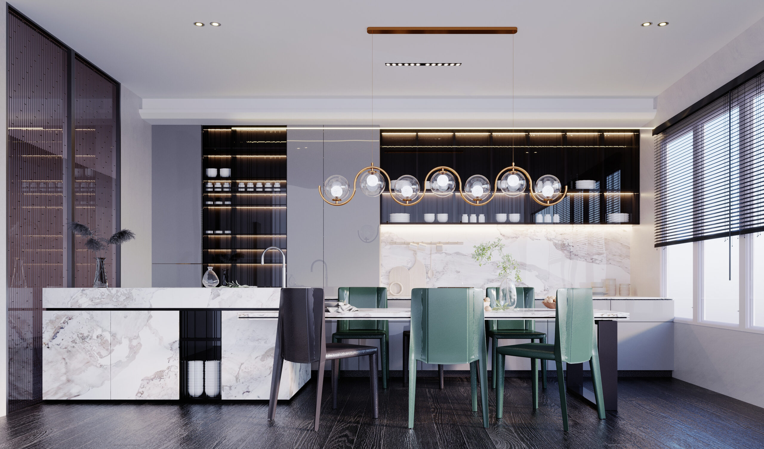
Yellow and earthy tones can feel optimistic, welcoming, and cozy, which is why they are often used in kitchens, dining areas, and living rooms.
Neutrals like white, beige, grey, and black shape mood through contrast: light neutrals feel open and serene, while darker tones add intimacy, drama, or sophistication.
Colour, Space Perception, and Behaviour
Lighter colours make rooms appear larger and more airy, helping small spaces feel open and less claustrophobic. Darker shades visually pull walls closer, creating a cocooning effect suited for media rooms, lounges, or intimate dining spaces. High-contrast schemes (such as dark-and-light pairings or complementary colours) feel bold and energetic, while low-contrast, tonal palettes feel calm and harmonious.
Practical Room-Wise Colour Strategies
Living room: Warm neutrals with accent colours (mustard, terracotta, teal) encourage conversation and comfort without overwhelming the senses.
Bedroom: Cool, desaturated hues like soft blues, greens, and lavenders help slow the mind and support rest; bold colours are best reserved for cushions, art, or a single feature wall.
Kitchen and dining: Yellows, warm whites, and earthy tones feel inviting and can subtly stimulate appetite and sociability.
Home office: Balanced palettes combining calm blues/greens with a touch of energising accent (like orange or yellow) support focus and creativity.